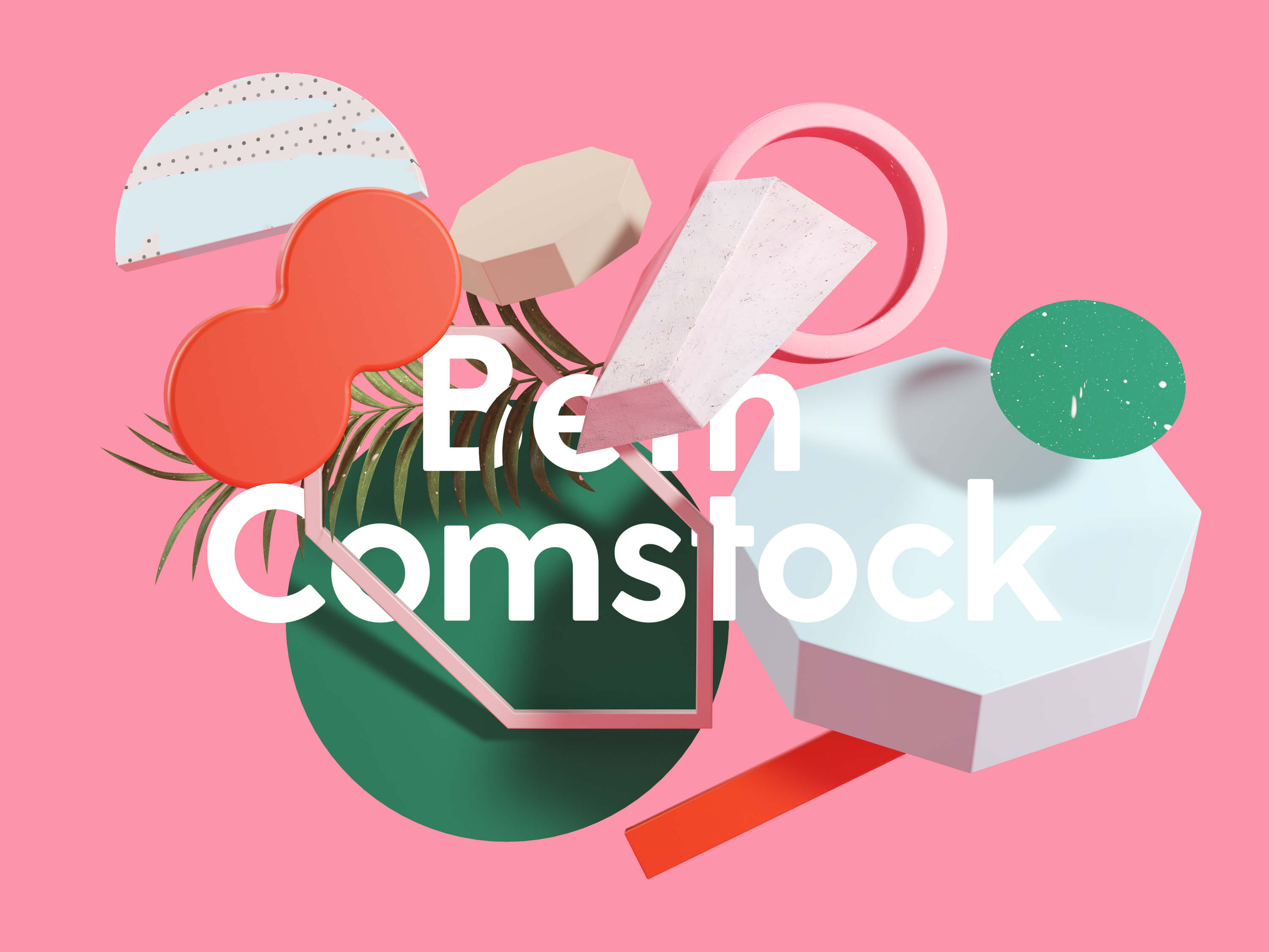
Beth Comstock
Infinite forms of colour for any piece of communication.


WEBSITE
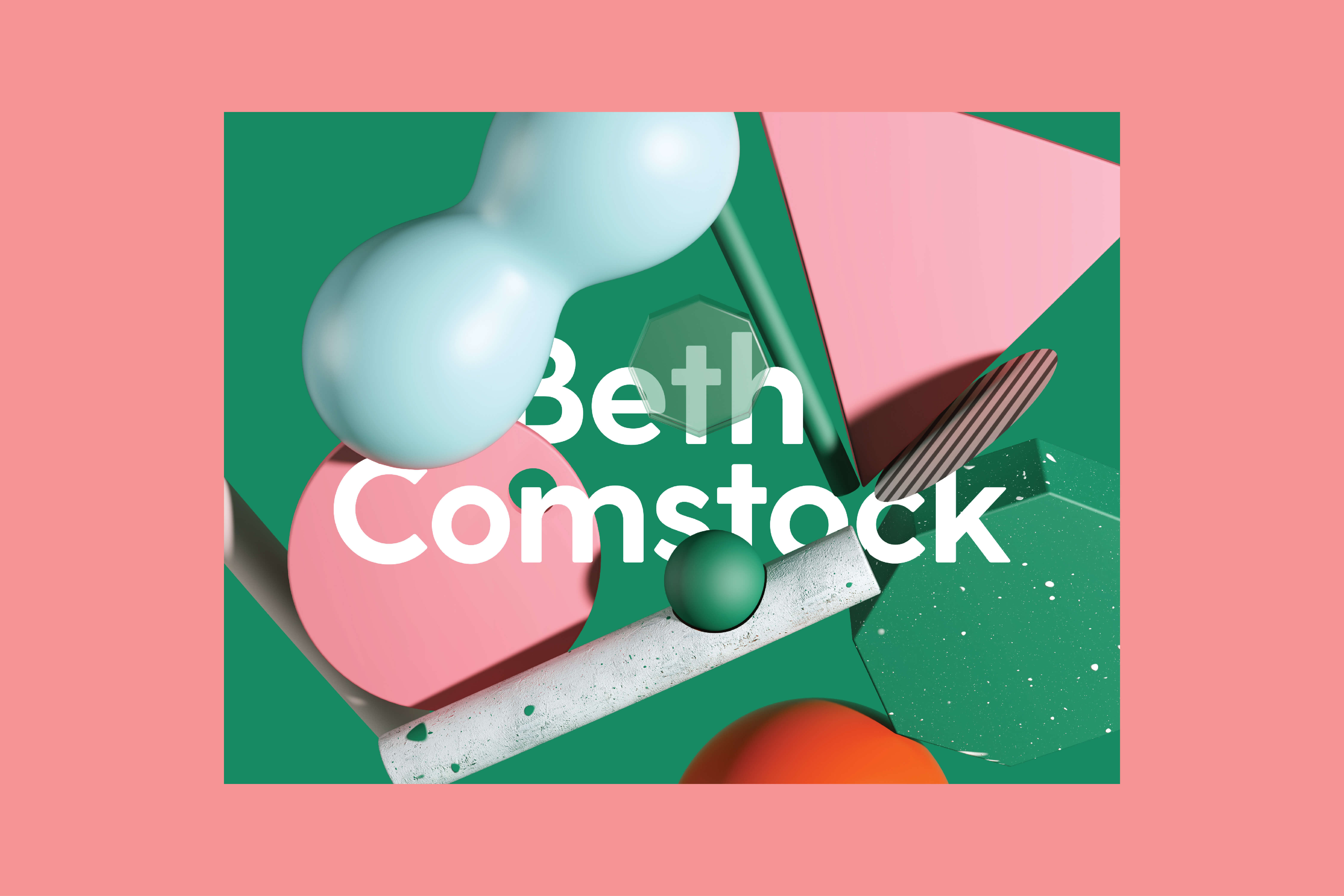


Beth Comstock
Infinite forms of colour for any piece of communication.
Beth Comstock is a brilliant woman making waves in technology and business. Currently the Vice Chair of GE, leading new growth and innovation. Beth’s main focus is “emergence,” and much of her writing revolves around how humans will interact with technology in the near future and how we will learn from machines as machines will learn from us—riveting stuff!
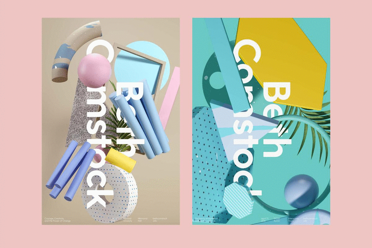
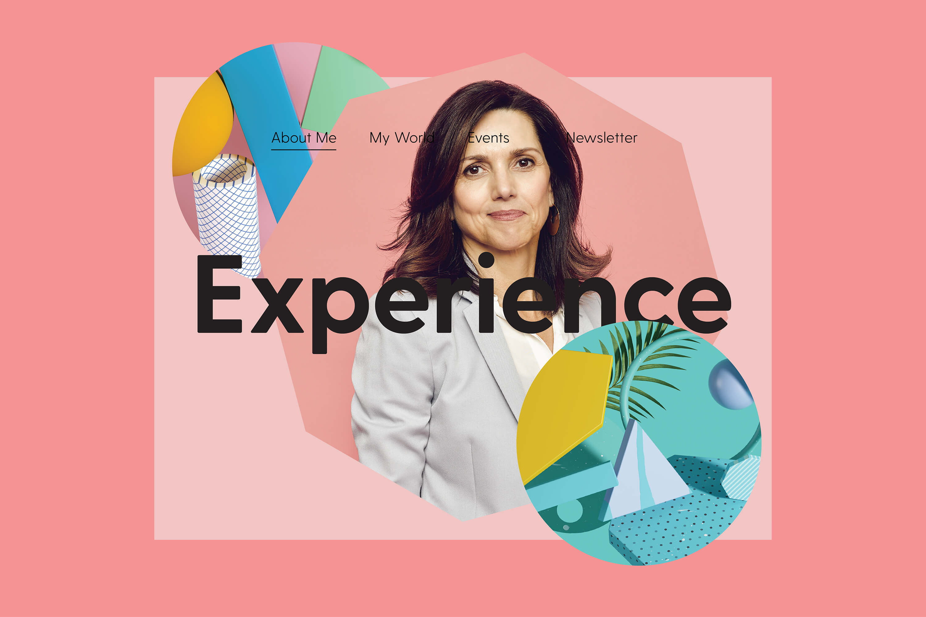
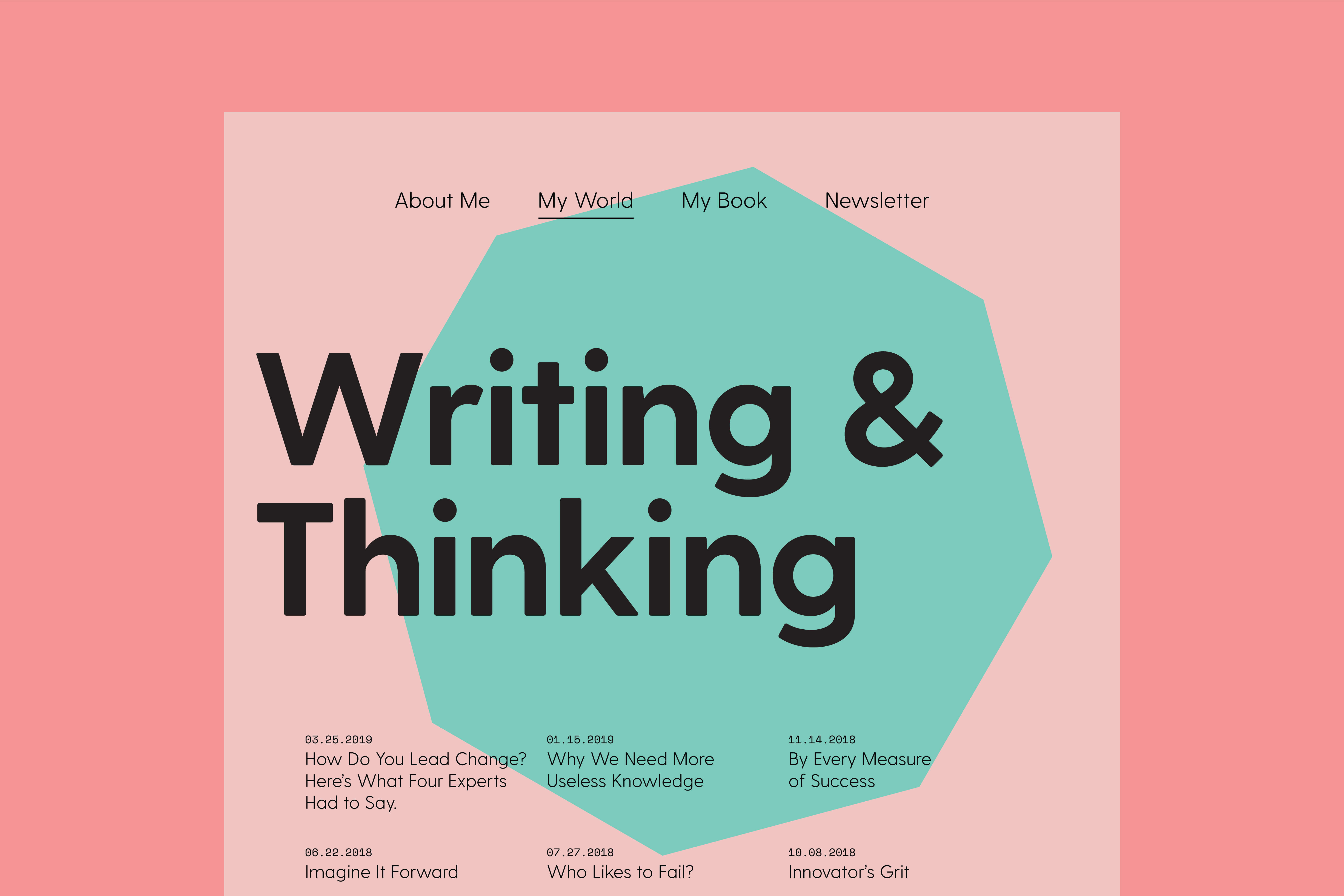
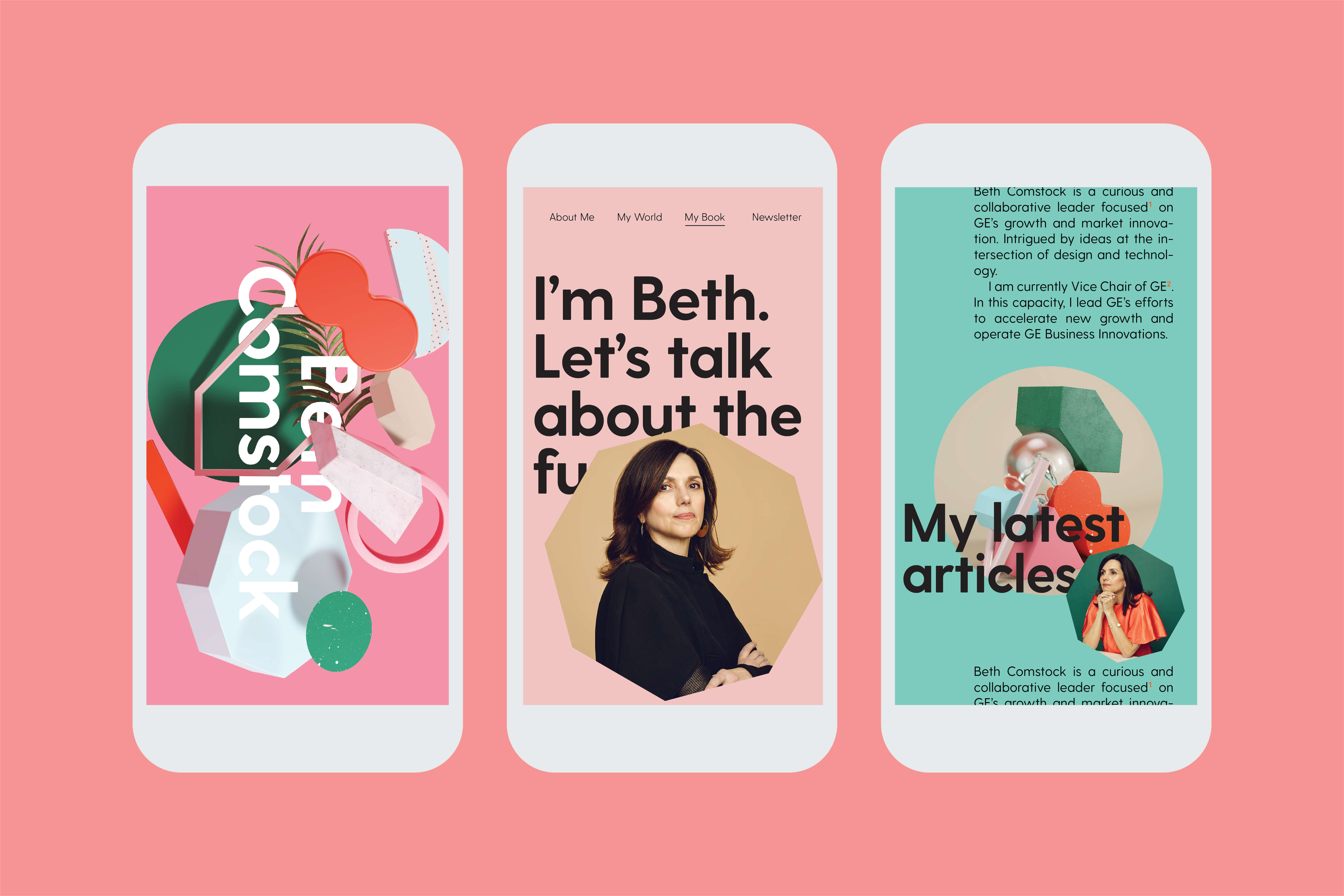
Our goal was to create a branding solution for Beth that would embody her ideas of change, evolution, innovation, and of course, emergence. As most tech companies are represented in some sort of hue of blue, we strived to shy away from that stereotype and focused more on a holistic and organic palette that could be broken down into acknowledgeable elements from her thinking. We broke down her thinking into five key shapes that would symbolize technology, emergence, change, inquisitiveness, and energy. We strived to have a hand in every aspect of her new brand, leading with the word mark and grazing elements such as portrait photography, 3D representation of her talking points, and an extensive system for her social content. Her site is playful, modern, and far from traditional, beckoning the user to take time to play with the subdued interactions and explore the content featured on each page.
All made with my creative and life partner Leta Sobierajsk.
Client: Beth Comstock
Beth Comstock is a brilliant woman making waves in technology and business. Currently the Vice Chair of GE, leading new growth and innovation. Beth’s main focus is “emergence,” and much of her writing revolves around how humans will interact with technology in the near future and how we will learn from machines as machines will learn from us—riveting stuff!
Our goal was to create a branding solution for Beth that would embody her ideas of change, evolution, innovation, and of course, emergence. As most tech companies are represented in some sort of hue of blue, we strived to shy away from that stereotype and focused more on a holistic and organic palette that could be broken down into acknowledgeable elements from her thinking. We broke down her thinking into five key shapes that would symbolize technology, emergence, change, inquisitiveness, and energy. We strived to have a hand in every aspect of her new brand, leading with the word mark and grazing elements such as portrait photography, 3D representation of her talking points, and an extensive system for her social content. Her site is playful, modern, and far from traditional, beckoning the user to take time to play with the subdued interactions and explore the content featured on each page.
All made with my creative and life partner Leta Sobierajsk.